Case study 02 · EdTech
Suma AI Bootcamp
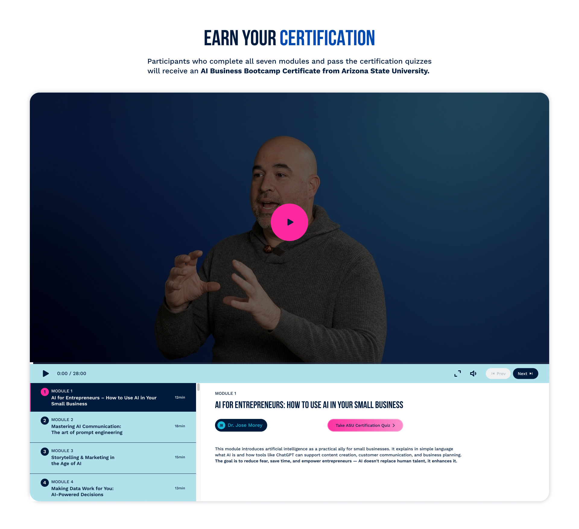
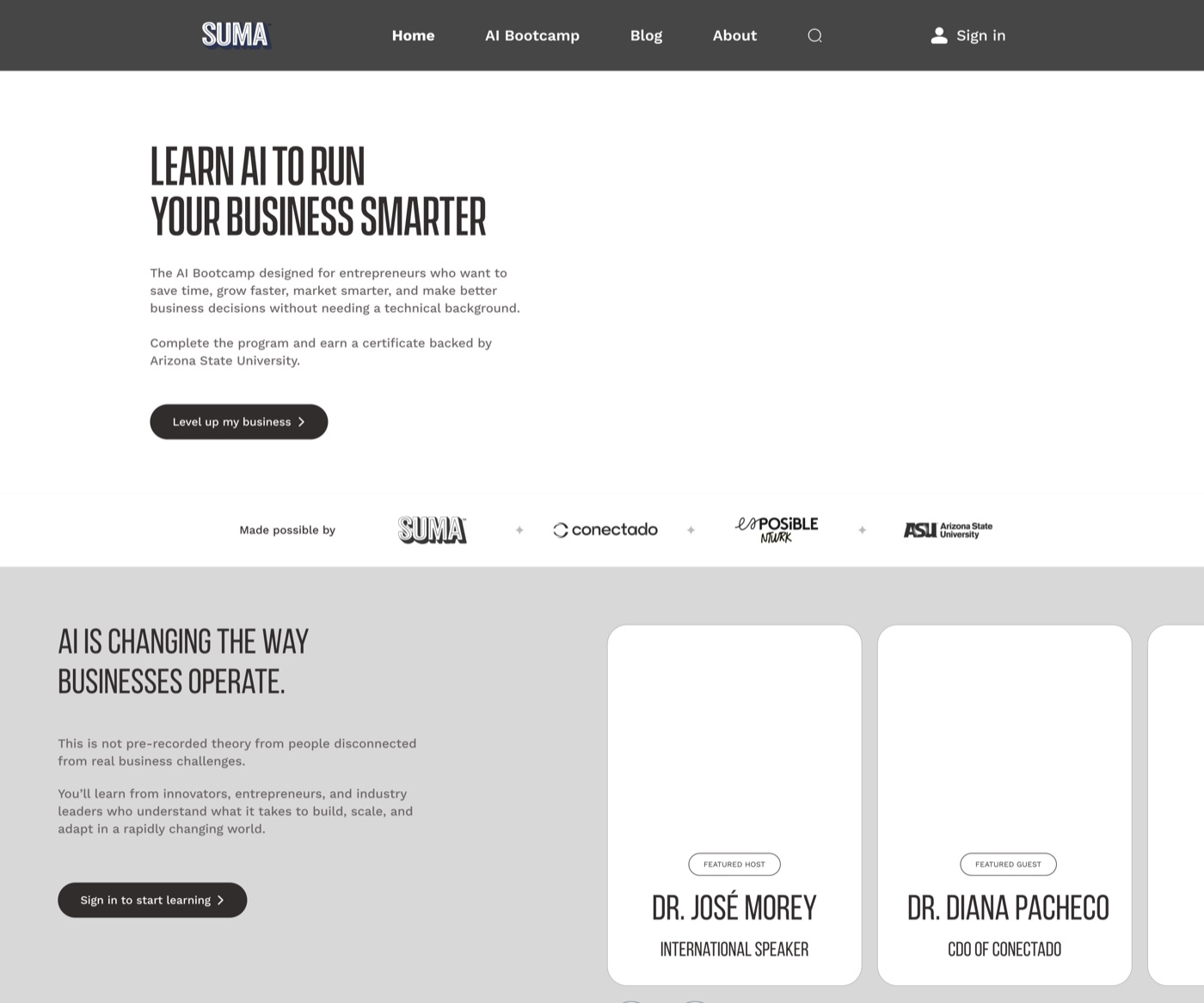
A certification bootcamp platform for Suma Wealth that teaches small business owners to use AI, built with Arizona State University and Conectado. I built the low-fidelity wireframe for the entire site and designed the video player and quiz flows myself, partnered with another designer on the final visual direction, then took ownership of accessibility across every screen. The same format later powered a second partnership with Cal State Northridge.
View live page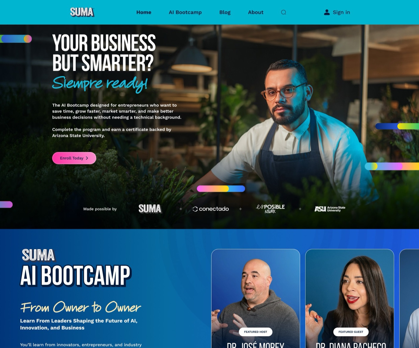
Overview
Suma Wealth wanted to teach small business owners how to actually use AI, and to certify them for it. Working with Arizona State University and Conectado, the team built a full learning platform: a marketing site, an account system, seven modules with video and quizzes, and a grant application at the end. I owned the structure and the accessibility, wireframing the whole journey before any visual design existed and then making sure the finished, high-contrast look still held up for real users.
What I owned, and what shipped
What I owned
- Mapped the full journey: marketing site, sign-in, seven modules, and grant application
- Built the low-fidelity wireframe the visual design was built on top of
- Designed the complete sign-up and log-in flow
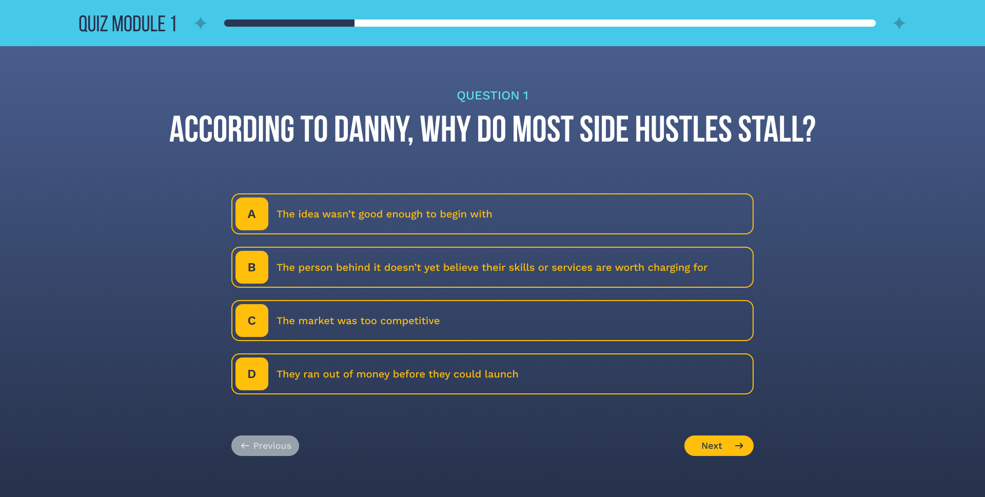
- Designed the video player and a test workflow after each module, question through pass/fail
- Audited every finished screen against WCAG contrast and sizing standards
What shipped
- A bold, high-contrast visual identity co-designed with another designer
- Seven certification modules with a working video player and quiz flow
- An AI Business Growth Grant flow for LA-fire-impacted business owners
- A fully clickable Figma prototype from sign-up through certification
Accessibility, by the numbers
Audited all 3 core screen templates (14 sections total) against WCAG AA standards for contrast and type size: every section had at least one violation. Corrected color contrast and font sizing site-wide to reach full AA compliance. Added descriptive alt text to 8 images for screen reader accessibility, rebuilding the platform's 2 key images at both desktop and mobile ratios to preserve them.
Process
I started from a blank page, wireframing the full journey from marketing site to certified graduate before any visual design existed. Once another designer landed the bold, high-contrast look, I went back through every screen for accessibility: contrast ratios, type scale, and tap targets sized for real hands, not just a mouse pointer.
The biggest challenge
Reconciling a bold, saturated brand palette with strict accessibility requirements. Bright gradients and small caption text look great until you check them against WCAG contrast ratios, so I re-balanced color and type screen by screen until both held up.
Screens
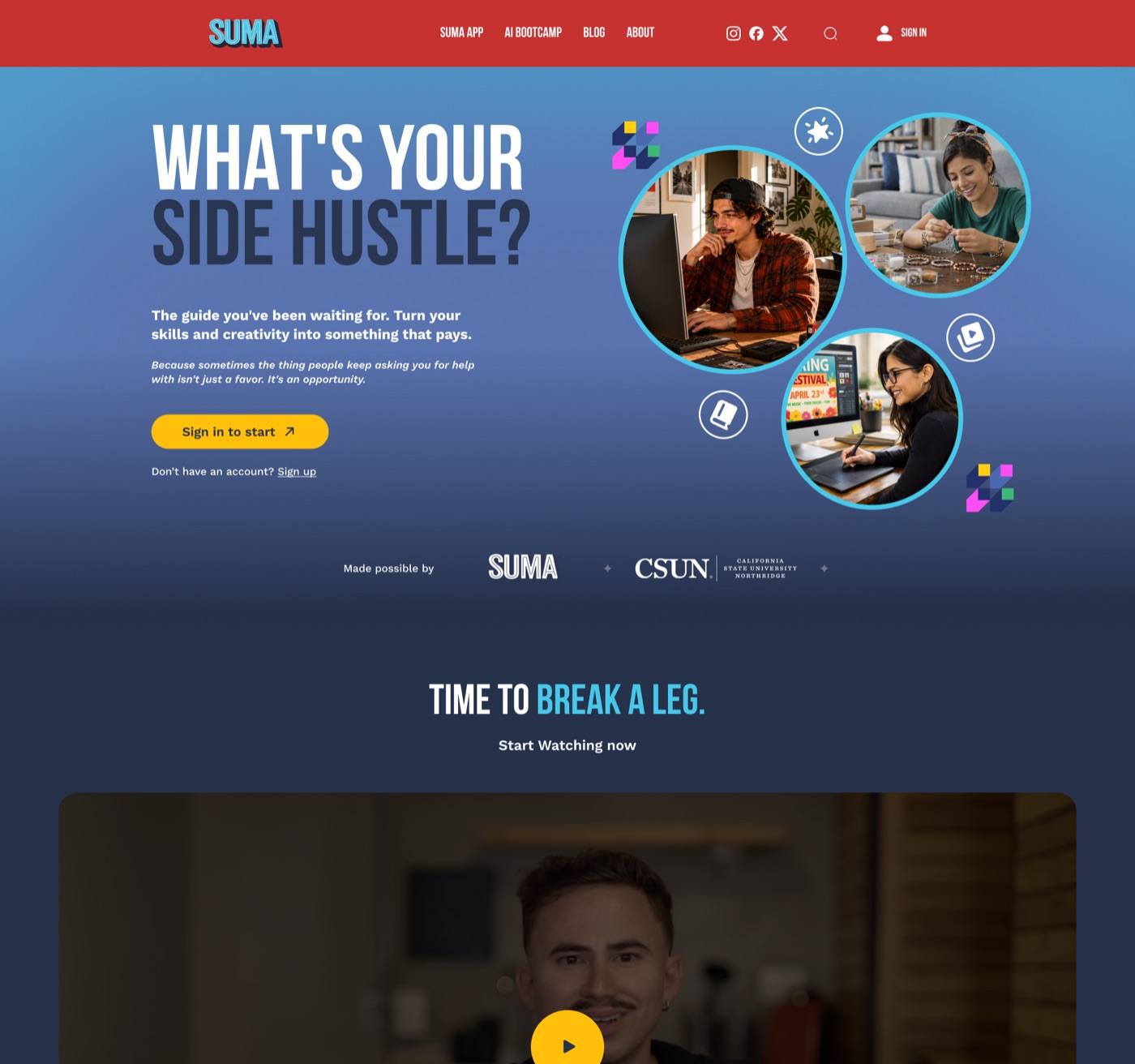
Also shipped: CSUN Side-Hustle Challenge
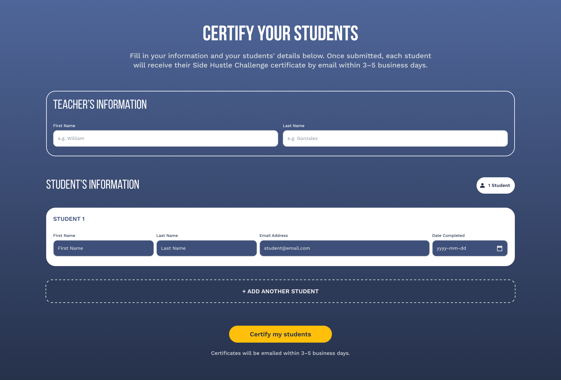
A parallel certification partnership with Cal State Northridge, built on the same format: six modules, a quiz, and a certificate flow, this time helping students turn creative skills into income. I also designed a separate tool for teachers to certify their own students once they finish the course, so classrooms can move through it as a group instead of one signup at a time.