Case study 01 · Fintech
Suma Wealth
Suma Wealth gives Latinos in the U.S. free financial education and tools. As the sole in-house designer, I rebranded the app's entire visual identity and shipped a native AI financial agent, all while still turning around 80+ other assets a month.
Overview
When I joined as the only in-house designer, the Suma Wealth app worked but did not feel like the confident, welcoming brand the company wanted to be. Screens leaned on web views, the layout was crowded, and the visual language felt a step behind the fintech apps people were comparing it to. Over sixteen months I rebuilt the visual system from the ground up, shipped a native AI financial agent, and kept the rest of the marketing engine running at the same time.
Who we designed for
Suma Wealth is built for Latinos in the U.S. who carry their families financially but were never handed a roadmap for it. Growing up, money wasn't talked about at home — and that silence compounds. In 2022, the typical white family held about five times the wealth of the typical Latino family: roughly $285,000 versus $62,000 (Federal Reserve, Survey of Consumer Finances). Camila represents the core user the redesign centered on: the family's main breadwinner, the first to go to college — and the first to carry student debt — figuring money out with no guide. Like much of Suma's audience she's paying down debt, and getting it under control is exactly what Suma is built to help with.
Pain points
Her parents never talked about money, so she started from close to zero · First in her family to go to college, and to take on student loans to get there · Carrying debt as the main breadwinner, with everyone leaning on her · Tools and advice rarely reflect her reality or her language
Goals
Manage and finally pay off her student loans and debt · Build credit, savings, and long-term investments · Financial confidence without needing to be an expert · Close the gap and build generational wealth
Motivations
Break a cycle no one prepared her for · Be the reason her family gets ahead · Feel confident and in control of her money
Behaviors
Mobile-first, learns from social media · Moves fluidly between Spanish and English · Trusts community and creators over institutions
What real users told us
Before the redesign shipped, we put it in front of real users. Three pieces of feedback stood out — and each one changed the design.
The cards looked like ads
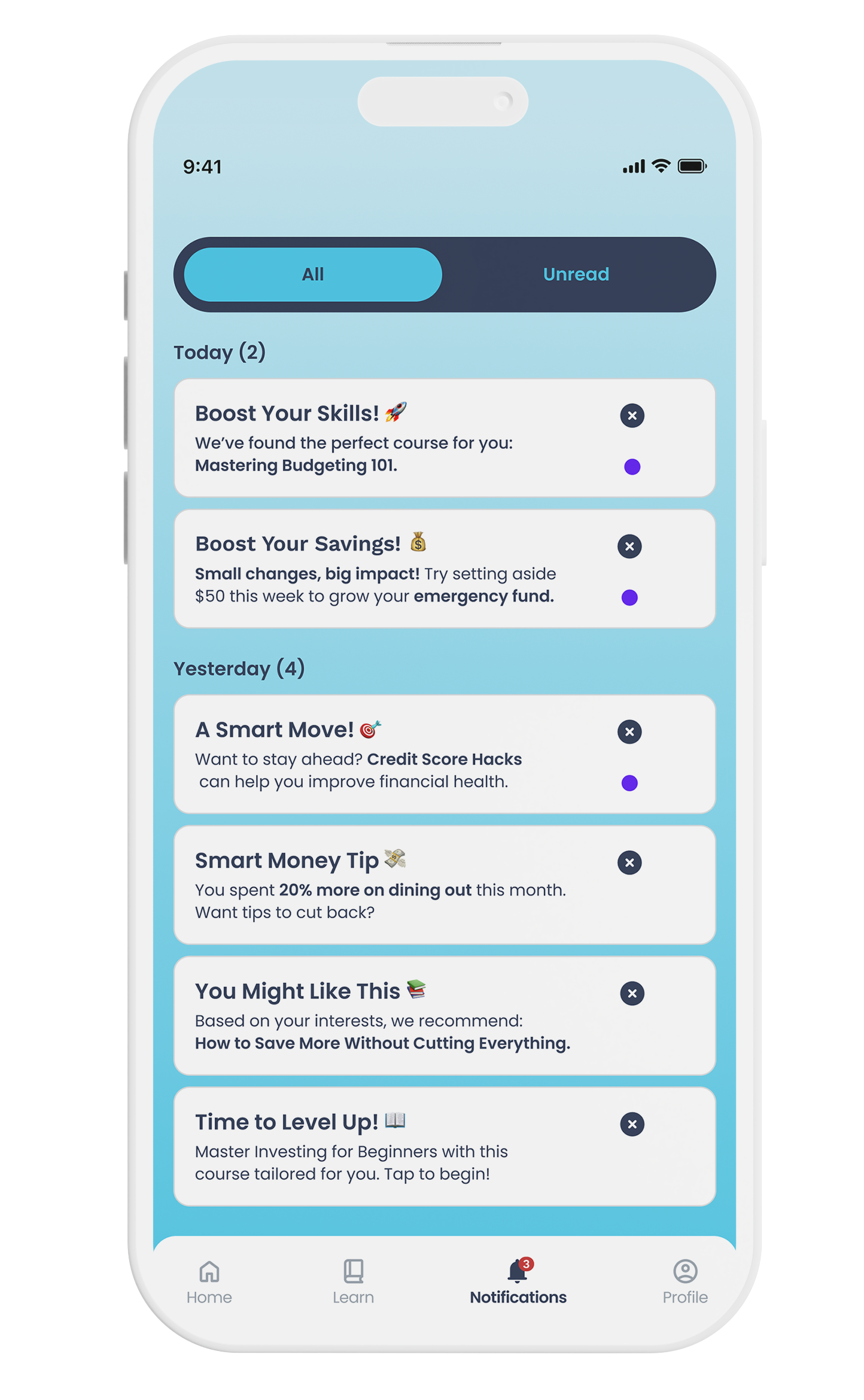
Users read the information cards at the top of the screen as advertisements and scrolled straight past them, missing content meant to help. That pushed us to cut the clutter and rework how that information is presented so it reads as part of the app, not a promotion.
No room to read
On the old web-view screens, users felt they had little to no space to actually review the information in front of them. Rebuilding those screens natively reclaimed vertical space and gave the content room to breathe.
The agent took over the screen
The AI agent's image sat at the bottom and often took up too much of the screen. So we made it movable — users can drag and place it wherever it fits, instead of it competing with the content.
The problem and the redesign
Before
- Web views capped what the app could actually do
- Info cards cluttered every screen
- Oversized logo ate the top of the layout
- Visual style felt dated next to competitors
- Navigation flows confused first-time users
After
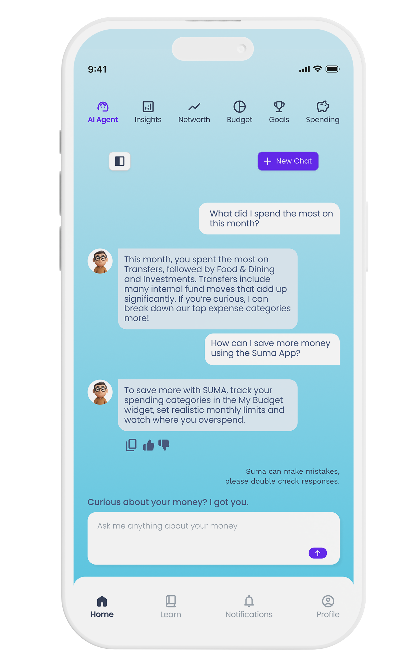
- Native AI financial agent, built in-house
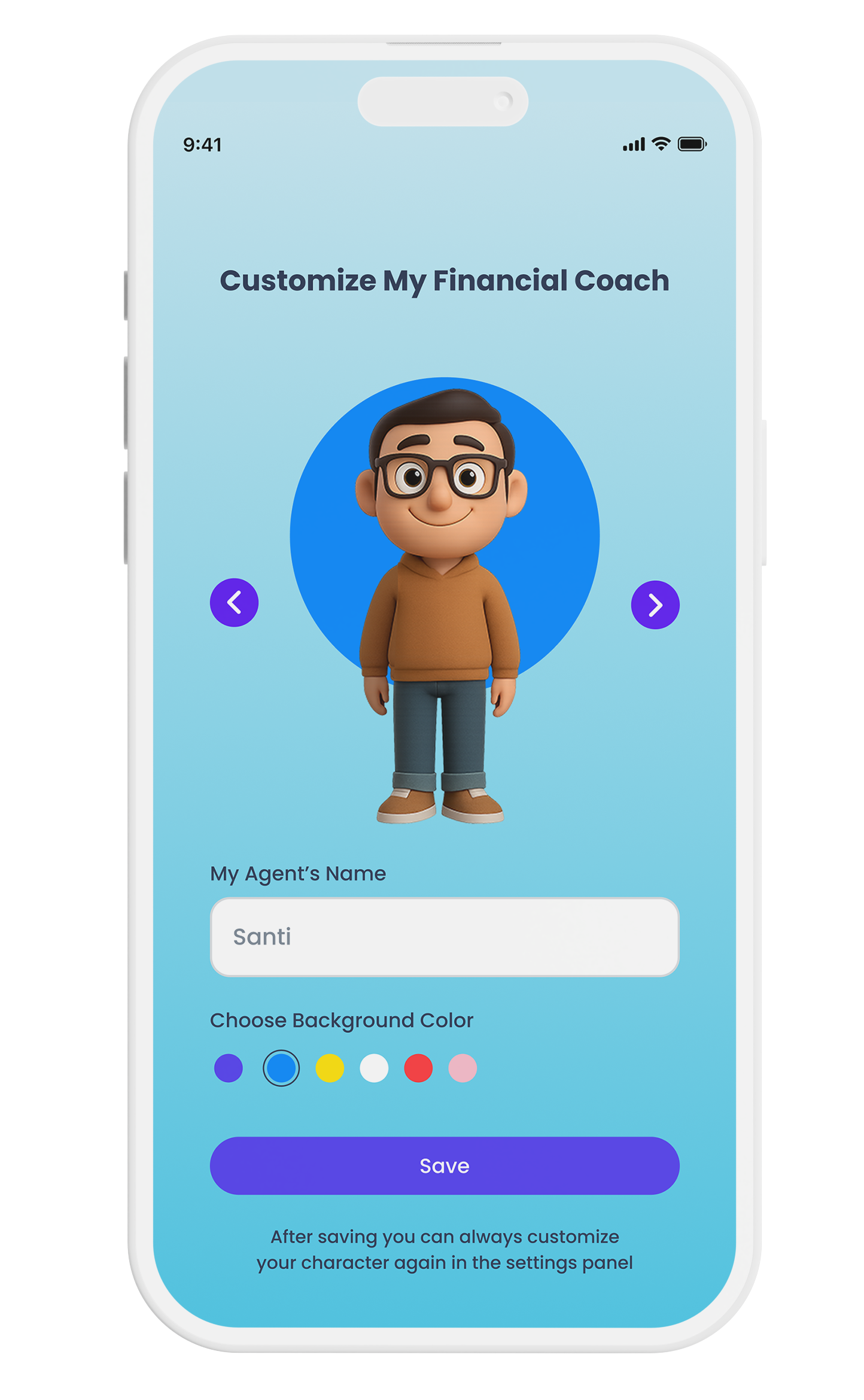
- Agent customization: name, gender, and background color
- Component library rebuilt from scratch, down to only what's essential
- Reclaimed vertical space across every screen
- Cooler, calmer palette, with red removed entirely
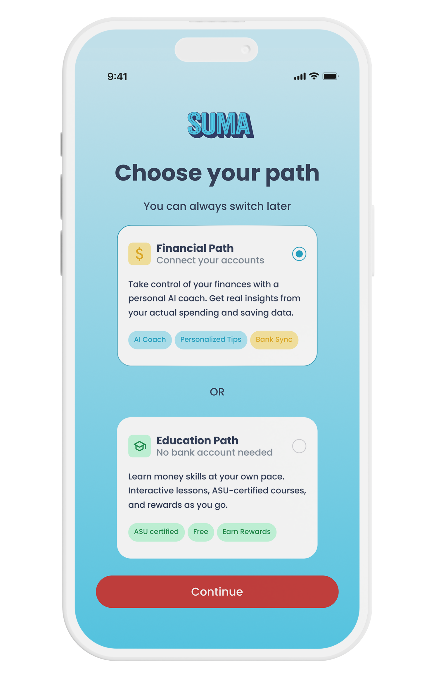
- New onboarding step to pick a free or connected-accounts path
The home screen, before and after
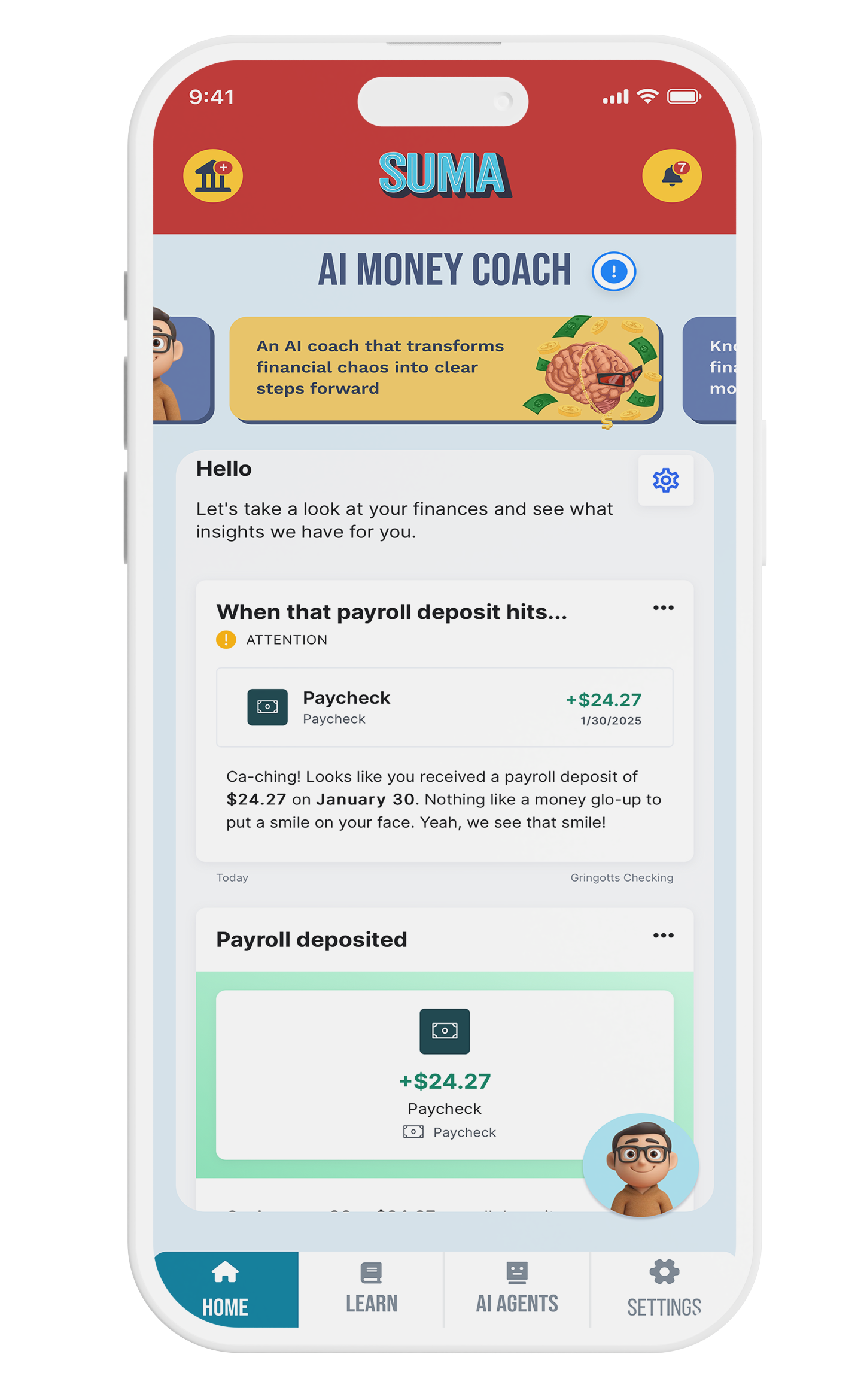
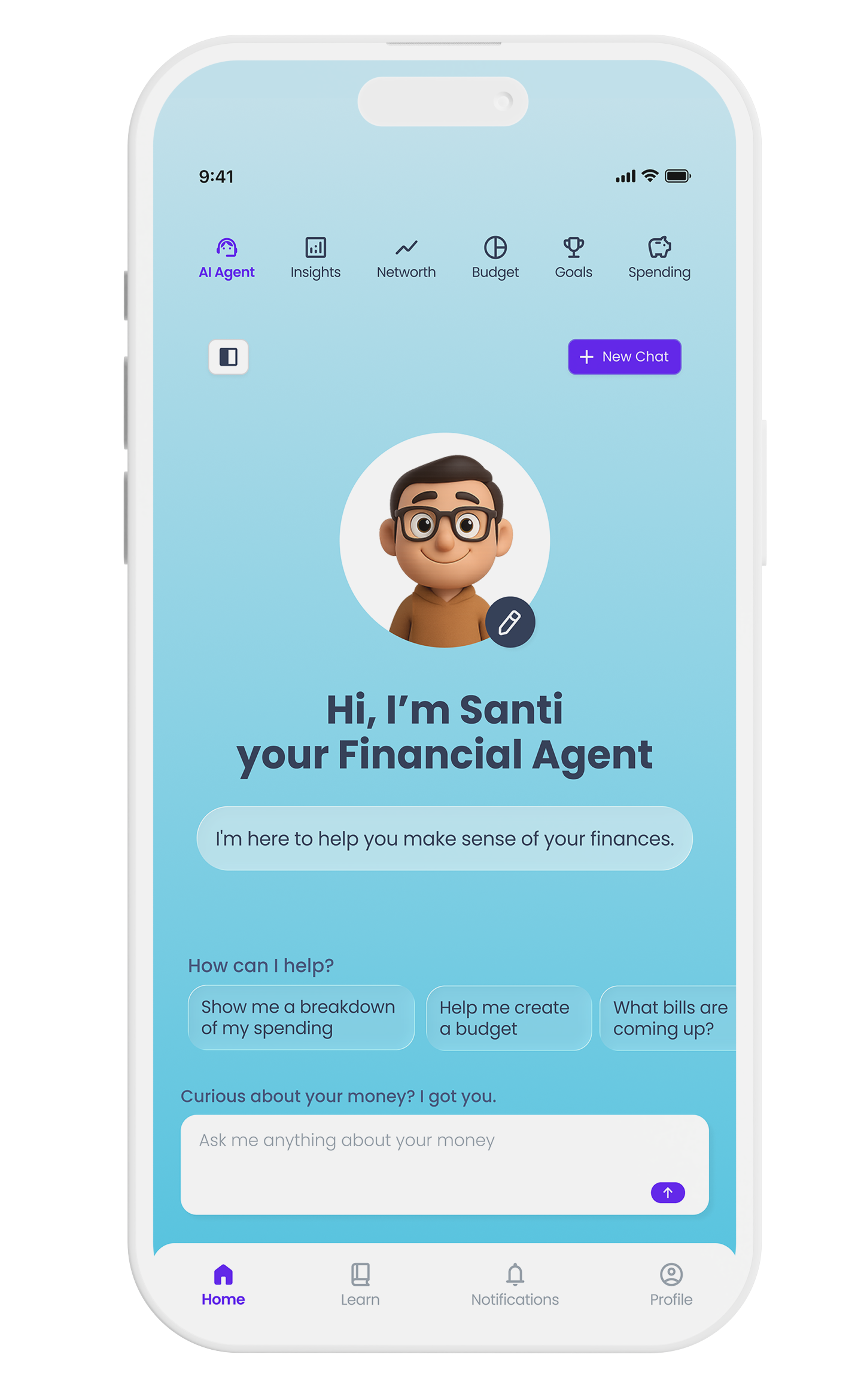
Users weren't confused about their money. They were confused by the app. Removing red from the palette and simplifying navigation lowered perceived stress before a single feature changed.
Impact
Process
I started with interviews across the existing user base to find where the experience broke down, then mapped the friction from end to end before touching a single screen. I rebuilt the visual system first, with a new palette and a redesigned component library covering navigation, buttons, and cards. Then I validated it with users again before it shipped, instead of assuming the redesign alone would help.
The biggest challenge
Convincing stakeholders that a visual reset, with no new features, could move engagement. I made the case with interview recordings instead of opinions, then tracked engagement before and after to back it up.
The original brief called for several separate agents, each handling a different task inside the app. Once we weighed that against what users actually needed, it was clear that one agent focused only on finances, the app's core job, would be both cheaper to build and easier for people to trust. I helped make that case, and Suma shipped with a single financial agent instead of a fleet of narrow ones. To make it feel less like a form and more like a companion, I proposed a customization screen where users name their agent, set its gender, and pick a background color.
Screens
Beyond the app
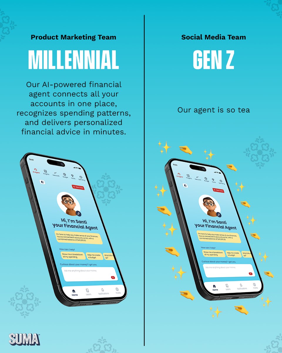
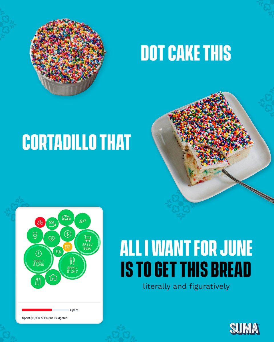
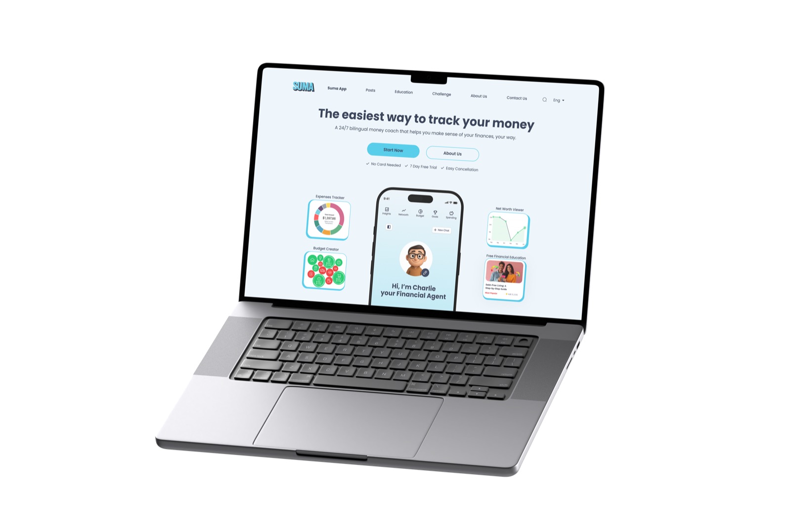
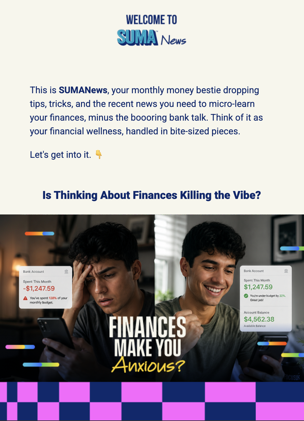
The app redesign is one piece of a bigger role. Every week I ship Suma's design out into the world: landing pages, social campaigns, event materials, and sales decks, often for several live projects at once.



Social campaigns
Financial education lands harder when it speaks the culture's language. A short mix from Suma's recent social calendar — product-forward posts that put the AI agent front and center, plus meme-native humor that meets the community where it already scrolls.